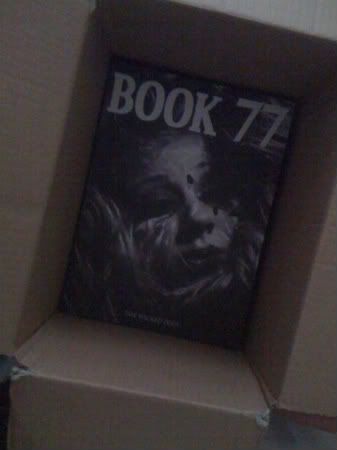


As promised, here are a selection of layouts i designed for Book 77.
The magazine was targeted at the British upper-class eccentric. The idea for the art direction was to remain quite regimented with a similar style to a newspaper, while at the same time bringing out Aleister Crowey's wickedness through the typography. The story for the typography was designed to reflect Crowley's progression through life, from his Cambridge education to his involvement in the occult and his alleged satanic worship. As each of the 5 chapters progress, the typography becomes crazier and crazier and more difficult to read.
The shoots, fonts and layouts all follow this idea of dark, mysterious wickedness that we found so inspiring from Aleister Crowley.
Im really happy with the way things turned out. It was a long process and despite having a couple of minor hiccups, it was definitely worth it! Im so proud of Book 77!
And maybe, just maybe we'll be seeing issue two making an appearance in the near future (a.k.a my Final Major Project!)
x


